COVID-19 County-level Data
A couple of quick scripts to plot up COVID-19 data in Harris County, Texas and Maricopa County, AZ. These plots are designed to emulate some of the data being used by Johnson Space Center to determine when more employees can return to work onsite. |
 |
 |
 |
 |
 |
 |
 |
 |
 |
 |
 |
How to read these plots
Two plots are generated: Daily confirmed cases and Cumulative confirmed cases. In both plots, bars represent daily values and lines represent a 5-day moving average. In the daily confirmed cases plot (top, orange), the color of the bars for the last 14 days of data indicate whether the 2-week trend in cases is increasing (red) or decreasing (green). Mousing over either plot shows you the value of the bars. Your cursor position is also shown to the lower right of the plots. You can interact (zoom, pan, return to home axes) with the plots using the gray icons that appear in the lower right of the plots when you mouseover either plot area.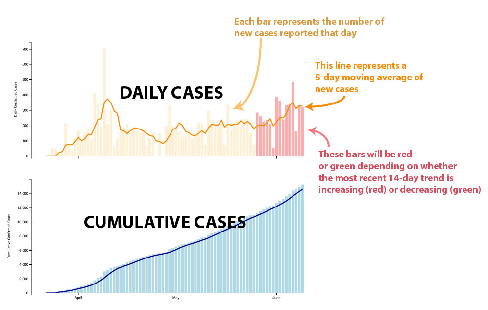
Data source
All data used here are from the Johns Hopkins Whiting School of Engineering Center for Systems Science and Engineering. https://github.com/CSSEGISandData/COVID-19/tree/master/csse_covid_19_data/csse_covid_19_daily_reports
The code that runs this webapp can be found at the github repository.
Author: Kayla Iacovino, 2020. MIT Licensed. kaylaiacovino@gmail.com.